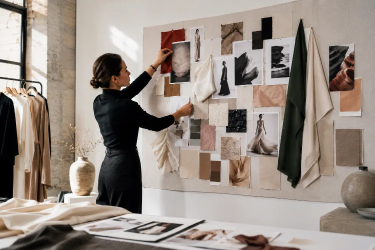
A fashion mood board can look beautiful and still be completely useless.
That usually happens when the board becomes a random collection of stylish photographs rather than a tool that actually guides design decisions.
A professional mood board should communicate the atmosphere, colors, materials, silhouettes, textures, and emotional direction of a project before the first finished garment exists.
Learning how to create a professional mood board for fashion design projects is therefore an essential skill for fashion students and emerging designers.
It helps turn broad inspiration into a focused visual language that can guide sketching, textile selection, styling, and collection development.
Fashion education often connects moodboarding with research and design communication. University of the Arts London, for example, includes mood boards as part of exploring color, texture, theme, garment ideas, and collection planning.
The goal is not to fill every empty space with images. A strong board is selective. Every element should help explain what your fashion project is trying to become.
1. Begin With a Clear Concept Before Collecting Images
Do not start by opening Pinterest and saving everything that looks interesting.
First, decide what you are researching.
Your starting point could be architecture, a historical period, a personal memory, nature, music, a social movement, technology, photography, or a particular environment.
Parsons places research and concept development at the center of fashion education, combining these with material exploration and visual communication.
For example, imagine your project is inspired by abandoned coastal hotels.
Instead of immediately searching for “fashion inspiration,” investigate the actual subject. Look at weathered walls, faded interiors, rusted metal, ocean colors, old travel photographs, damaged tiles, vintage furniture, and architectural forms.
This kind of reseach produces more original design material because you are interpreting a subject rather than copying existing fashion.
Try defining the project in one sentence before continuing.
Perhaps your concept becomes: A collection exploring faded luxury and the way coastal environments slowly transform human-made spaces.
That statement gives your mood board direction.
2. Collect More References Than You Actually Need
The first stage of moodboarding should be generous.
Collect photographs, paintings, objects, fabric references, architecture, historical images, drawings, movie stills, textures, and anything else connected to your concept.
Do not worry about the final layout yet.
Parsons students working on a collaboration with Ann Demeulemeester, for example, studied garments, sketches, archives, and mood boards while drawing additional inspiration from cinema, music, literature, and photography.
This demonstrates an important principle: fashion research does not have to come from fashion.
An image of cracked pavement might inspire embroidery. A sculpture could influence a sleeve shape. A photograph of fog may suggest transparent layering.
Adobe similarly describes mood boards as visual planning tools that can combine colors, textures, materials, imagery, and other references before final design decisions are made.
At this point, collect freely.
Editing comes next.
3. Edit Ruthlessly Until a Visual Direction Appears
Professional mood boards are usually defined as much by what they remove as by what they include.
Suppose you have collected 80 images.
Look at them together and identify repetition. Perhaps certain colors keep appearing. Maybe several references contain rounded structures, transparent surfaces, or long horizontal lines.
Those repetitions are clues.
Begin removing images that are interesting but do not strengthen the central concept.
Canva describes a mood board as a collection of elements such as images, textures, typography, colors, and descriptive ideas used to establish a project’s visual direction.
A professional fashion board does not need 50 photographs.
Sometimes 10 carefully chosen references communicate much more clearly than 40 unrelated ones.
Ask one question about every image:
What does this contribute to the collection?
If you cannot answer, remove it.
4. Build a Focused Color and Material Story
Color should emerge naturally from your research rather than being added at the end.
Look across your strongest images and identify repeated hues.
For the abandoned coastal hotel concept, you might discover faded aqua, chalky white, oxidized brown, muted beige, and deep ocean blue.
Turn those colors into a small palette.
Then introduce material references.
Include close-up images or physical swatches of fabrics that relate to the concept. Perhaps washed linen communicates faded interiors, translucent organza suggests sea mist, while rough cotton reflects weathered surfaces.
A good fashion mood board often combines atmosphere with tangible design information.
Adobe recommends using varied visual references, including textures and materials, while emphasizing that the board should help establish a clear creative direction.
If you are working physically, real textile swatches can make the board much more useful.
Digital boards can include high-quality scans or photographs of those materials.
Do not choose a pallete simply because the colors look attractive together. Ask whether they support the story you are developing.
5. Include Shape and Silhouette References
A fashion mood board should eventually influence clothing.
This sounds obvious, yet many boards contain beautiful landscapes and photographs without any indication of how those references might become garments.
Look for shapes.
Architecture, sculpture, furniture, shadows, plants, machinery, and even typography can suggest silhouettes.
A curved staircase might inspire spiral draping. A rectangular building facade could become structured paneling. An oversized piece of industrial machinery might suggest exaggerated shoulders.
Translate Rather Than Copy
The goal is not to put a picture of a building on a dress.
The goal is to identify the design qualities hidden inside the reference.
Parsons describes fashion design as a process connecting form, silhouette, material, research, and broader conceptual thinking.
Try placing quick silhouette sketches beside your research images.
This immediately makes the mood board more useful because viewers can see how inspiration is beginning to transform into fashion.
Even simple black shapes can communicate volume and proportion effectively.
6. Create Visual Hierarchy in the Layout
Once you have selected your content, composition becomes important.
Not every image should have the same size.
Choose one or two dominant references that communicate the central mood immediately. Supporting images can be smaller.
Adobe’s recent mood-board guidance specifically recommends resizing references to create stronger visual hierarchy, allowing key images to carry greater visual weight while supporting elements remain secondary.
Think about the board as a visual conversation.
Large images attract attention first. Smaller texture details provide supporting information. Color swatches reinforce the palette, while sketches can show emerging design ideas.
Also use negative space.
Do not feel pressured to cover every centimeter.
Too much content makes it difficult to understand which references matter most.
Your layout should guide the eye naturally rather than forcing viewers to search through visual clutter.
A strong visul hierachy makes even a relatively simple mood board look much more professional.
7. Decide Between Physical and Digital Mood Boards
Both formats have advantages.
A physical board allows you to work directly with fabric, paper, thread, paint, photographs, found objects, and tactile surfaces. This can be especially valuable for textile-heavy projects.
Digital mood boards are easier to edit, duplicate, organize, present, and share.
Adobe notes that digital boards make it simple to rearrange ideas, test materials and colors, and communicate concepts with collaborators.
Canva similarly offers grids, frames, image uploads, color elements, and collaborative editing for digital moodboarding.
You can also combine both approaches.
Create physical experiments first, photograph or scan them, and then arrange everything digitally for your portfolio presentation.
What matters most is not the software.
Photoshop, Illustrator, Canva, Adobe Firefly, presentation software, or even a simple physical board can work well when the underlying concept is strong.
Do not let complicated tools distract you from design thinking.
8. Make Sure the Board Can Actually Guide a Collection
Before considering the mood board finished, test it.
Hide your concept statement and look only at the visuals.
Can you identify the atmosphere? Is the color direction obvious? Are there recognizable textures? Can you imagine possible silhouettes or garment details?
Then begin sketching.
If the board gives you enough information to generate multiple garment ideas, it is doing its job.
FIT professor Anna Kiper’s work on fashion portfolio development connects research, silhouettes, mood boards, garment details, textiles, fabric manipulation, and final collection development as parts of the same creative process.
This connection is important.
A mood board should not become an isolated portfolio page that you forget about once sketching begins.
Keep returning to it.
When you are unsure whether a new fabric, color, print, or detail belongs in the collection, compare it with the board.
If the answer consistently feels wrong, your visual direction is probably telling you something.
9. Avoid the Most Common Mood Board Mistakes
One common mistake is using too many fashion runway images.
When most of your references come from existing designers, your collection can easily begin resembling their work.
Another problem is choosing images only because they share the same color.
Color coordination alone does not create a meaningful concept.
Your references should also communicate shape, atmosphere, surface, emotion, material, movement, or cultural context.
Avoid excessive text as well.
A few keywords can support the visuals, but a mood board should not require several paragraphs to explain itself.
Finally, use good-quality images.
Pixelated screenshots, visible watermarks, inconsistent cropping, and poorly scanned materials can quickly make a portfolio presentation feel unfinished.
Professional does not mean complicated.
It means intentional.
Learning how to create a professional mood board for fashion design projects is really about learning how to edit ideas.
You begin with broad research, identify meaningful patterns, develop a focused palette, explore materials and silhouettes, and organize everything into a clear visual story.
The strongest mood boards do more than look attractive. They actively guide sketching, textile choices, styling, garment development, and the final collection.
For your next fashion project, collect widely but edit aggressively. Choose references that offer useful information rather than simply looking fashionable, and keep checking whether every image supports your concept.
Start with one subject that genuinely interests you, build a small research archive around it, and create a board that makes someone understand your design world before they see a single finished garment.