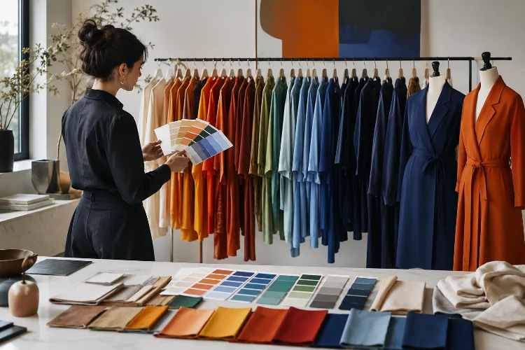
Imagine a fashion collection with beautiful silhouettes, expensive fabrics, and technically perfect construction-but every look uses colors that seem completely disconnected. Even when the individual garments are strong, the collection can still feel confusing.
That is where color theory becomes extremely useful.
Understanding how color theory helps fashion designers build stronger collections gives designers a system for making color choices with intention instead of simply choosing shades they personally like.
Color can create mood, connect different looks, highlight important details, communicate brand identity, and guide the viewer’s attention throughout a collection. Fashion schools treat color as a core design skill for exactly this reason.
Parsons explores color harmony and interaction in its fashion design training, while the Fashion Institute of Technology teaches traditional color systems and their application to textiles.
The goal is not to follow rigid rules. Color theory gives designers a foundation they can use, adapt, and occasionally break. Once you understand why colors work together, creating a cohesive fashion collection becomes much easier.
1. Start With Hue, Value, and Saturation
Before building a fashion color palette, it helps to understand three basic characteristics: hue, value, and saturation.
Hue is what we normally mean when we say color-red, green, blue, orange, or violet. Value describes how light or dark that color appears, while saturation refers to its intensity.
Adobe explains that modern color systems consider not only hue but also differences in lightness and saturation when organizing color relationships.
These differences matter enormously in fashion.
Imagine designing an entire collection around blue. Bright electric blue can feel energetic and futuristic. Muted dusty blue may communicate calmness, while deep navy creates a more formal impression.
The hue remains blue, but changing value and saturation creates completely different moods.
Fashion students should therefore avoid thinking only in simple color names. Instead of writing “green” on a mood board, determine whether you actually want acidic lime, muted sage, dark forest, or pale mint.
That extra precision creates a much clearer design direction.
2. Use the Color Wheel to Build Better Palettes
The color wheel is one of the simplest tools for understanding how colors relate to one another.
Adobe describes several common color relationships, including complementary, analogous, triadic, and monochromatic combinations. These systems help designers create palettes that feel harmonious or intentionally contrasting.
An analogous palette uses neighboring colors, such as blue, blue-green, and green. Because the hues are closely related, the result often feels smooth and cohesive.
A complementary scheme combines colors positioned opposite each other, such as blue and orange. This creates stronger visual contrast.
A triadic palette uses three colors spaced around the wheel, producing more variety while maintaining a structured relationship.
Fashion designers do not need to apply these formulas perfectly.
You might create a mostly analogous collection and introduce one complementary accent color in bags, shoes, stitching, or accessories.
The color wheel is not there to limit creativity. It simply helps explain why certain combinations feel naturally connected while others create tension.
3. Build One Dominant Color Story for the Collection
One common beginner mistake is trying to use too many colors at once.
A collection may include ten garments and fifteen interesting shades, but that does not necessarily make the result stronger. Without hierarchy, the viewer may struggle to understand the collection’s identity.
A better approach is to create a dominant color story.
Start with several core colors that represent the concept. Then add supporting tones and perhaps one or two accents.
For example, imagine a collection inspired by desert landscapes. The main palette could include sand, clay, warm brown, and faded beige. A small amount of turquoise could then become an accent inspired by desert skies or traditional jewelry.
The Fashion Institute of Technology teaches color theory specifically within textile design, including how intentional color choices affect meaning, matching, printing, and final material outcomes.
This shows why a collection palette should work as a system rather than as separate decisions.
Try placing fabric swatches from every proposed garment next to each other. If several colors feel like they belong to a completely different project, the palette probably needs more editing.
4. Use Color to Create Mood and Emotional Direction
Color does more than make garments attractive. It can influence how a collection is emotionally perceived.
Parsons’ Color Across the Spectrum course examines the cultural, social, psychological, symbolic, and perceptual dimensions of color, including how designers use harmony and contrast.
UAL also teaches color psychology through the relationship between perception, emotion, harmony, and creative decision-making.
A designer developing a peaceful minimalist collection might choose low-saturation neutrals and soft tonal transitions.
A sportswear collection designed around energy could use bright contrasting hues.
Meanwhile, a collection exploring mystery might rely on dark values with occasional intense accents.
However, color psychology should not become a simplistic equation such as “red always means passion.”
Color meanings can vary across cultures, historical periods, contexts, materials, and individuals. Parsons specifically examines these cultural and social dimensions, reminding designers to consider their audience rather than assuming every color communicates universally.
Think of emotion as a design question, not a fixed rule.
5. Consider How Color Changes Across Different Fabrics
A color selected on a computer screen will not necessarily look identical when produced in fabric.
Material changes color perception.
Black velvet absorbs and reflects light differently from black satin. White cotton can appear crisp and matte, while white silk might feel luminous because of its reflective surface.
Texture also affects visual intensity.
A highly saturated red can look incredibly bold on smooth vinyl but softer when translated into fuzzy mohair.
This is why textile testing is an essential part of color development. FIT’s textile curriculum combines color theory with practical work involving textile surfaces, digital tools, printing, and color matching.
Designers should work with physical swatches whenever possible.
Place materials under different lighting conditions. Compare them beside each other rather than individually. Photograph them, drape them, and observe how folds create shadows.
A fabirc that seemed perfect in a small sample may become visually overwhelming when used across an entire oversized coat.
Color decisions need to consider scale and material at the same time.
6. Use Contrast to Control Attention
Color can tell the viewer where to look first.
If nine garments are neutral and one dress is bright red, that red design will probably become a focal point.
Designers can use this intentionally.
Complementary colors create particularly strong contrast because they occupy opposing positions on the color wheel. Adobe notes that these combinations can produce high visual energy and help specific elements stand out.
Contrast can also come from value.
A pale cream detail against a black jacket may attract attention even though neither color is highly saturated.
Think About Visual Hierarchy
When designing each outfit, ask where the eye should go first.
Perhaps you want attention on an unusual neckline. A contrasting collar can emphasize it.
Maybe the silhouette is already extremely complicated. In that case, keeping the entire garment within a narrow tonal range can prevent color from competing with the shape.
Strong design often involves deciding what not to emphasize.
Color should support the silhoutte, construction, and concept rather than fighting with them.
7. Use Color Repetition to Connect Different Looks
Collections need variety, but they also need continuity.
Color repetition is one of the easiest ways to connect garments with different silhouettes.
Imagine a twelve-look collection.
The opening outfit introduces burgundy through a coat. A later outfit repeats the color in trousers. Another uses it only in embroidery, while the final evening dress brings burgundy back as the dominant shade.
These repetitions create visual memory.
Even if the garments have different shapes and materials, the recurring color tells the viewer they belong to the same collection.
Parsons’ fashion design curriculum connects color and pattern exploration with broader visual communication and concept development, reinforcing the idea that color supports a designer’s overall aesthetic rather than functioning separately.
Try viewing your collection as small thumbnails.
At that scale, details disappear, but the rhythm of colors becomes obvious.
If all the dark looks accidentally sit together and all the bright outfits appear at the end, rearranging the lineup could create a much stronger visual rythm.
8. Use Color Trends as Information, Not Instructions
Fashion designers also need awareness of broader color trends.
Pantone’s Fashion Color Trend Reports identify prominent colors appearing around major fashion weeks.
Its Autumn/Winter 2026–2027 New York report, for example, presents ten standout shades alongside five more seasonless colors observed in the fashion landscape.
Trend information can help designers understand what is happening in the wider market.
But following every fashionable color is rarely a good strategy.
A designer should ask whether a trending shade fits the collection concept, customer, brand identity, season, and materials.
Imagine that bright yellow becomes commercially popular, but you are developing a quiet collection inspired by winter landscapes. Forcing yellow into the collection simply because it is trending could weaken the concept.
Trend forecasting should provide context rather than dictate creative decisions.
Pantone itself positions its forecasting work as design direction informed by broader cultural movements, materials, finishes, color psychology, and global perspectives.
The strongest designers understand trends without becoming controlled by them.
9. Edit the Final Palette Before Production
Color development should continue throughout the design process.
Once fabrics, silhouettes, prints, and samples exist together, revisit the palette.
Some shades that looked perfect on the mood board may no longer work.
Create a final collection lineup and examine the color distribution from beginning to end. Look for unnecessary repetition, accidental gaps, overly dominant accents, and colors that appear only once without a clear reason.
You can also create several digital colorways before committing to expensive samples.
Parsons includes color theory within its fashion design certificate and emphasizes color harmony, interaction, textiles, concept development, and construction as connected parts of design education.
That connection is important.
The best palette is not necessarily the most beautiful group of colors in isolation. It is the group that strengthens the garments, concept, materials, customer, and overall collection.
Understanding how color theory helps fashion designers build stronger collections gives designers a practical framework for making more confident visual decisions.
Hue, value, saturation, harmony, contrast, psychology, textile behavior, and repetition can all influence how a collection is experienced.
Color theory does not mean every combination has to follow a traditional formula. Instead, it helps designers understand the relationships they are creating-and gives them more control when they intentionally break those relationships.
For your next project, start with a small palette instead of choosing colors garment by garment. Test the shades across fabrics, silhouettes, and different lighting conditions, then view the entire collection together.
When color supports the story rather than distracting from it, even very different garments can feel like parts of one clear and memorable creative world.